Status : Live
Airport Service Platform
Simplifying
Flight Booking service for Stress free Travel

Role
Product Designer
Duration
1 month
Platform
Mobile
Team
Prachi Kadam
Mahek Shaikh
Antara Karthik
Govind A
Timeline
4 months
Tools
Figma, Fig jam, Miro, Photoshop, Zoom
Team
Lead Information Technologist
3 Product Designers (Including me)
3 Mobile Developers
Product Overview
Bangalore's Kempegowda International Airport (BLR) is a bustling hub for travel, retail, dining, and live entertainment, and is on a mission to become one of the most digitally advanced airports globally. Serving over 30 million passengers annually, the 'BLR Airport App' is crucial for enhancing the overall customer experience. In the 4th phase of its development, the app highlighted the need for flight booking services. This integration would not only allow travelers to seamlessly plan their entire journey but also solidify BIAL's position as a one-stop destination for all travelers.
The Challenge
How might we reduce anxiety for users when booking flights?
Research has indicated that over 60% of individuals encounter stress when booking flights. The primary challenge was to revolutionize the user experience within flight booking applications in the midst of numerous aggregators. This involved pinpointing the sources of this anxiety and alleviating them, all while ensuring that airport profits remained unaffected.
My Role
As a part of the product team, I led the end-to-end design of the BLR airport app's flight booking service experience, including all product research, stakeholder communication, design, and prototyping. I also set up weekly meetings with developers, designers, and product managers to iterate rapidly while considering diverse perspectives in my work.
BLR Airport App goal:
"Not just a Pitstop,
but a Destination"
The Impact
In our pursuit of reducing airport anxiety, we achieved the following impact metrics for the final shipped product:
4.5
20%
15%
Customer
Rating
Revenue Growth
Stress Level
Reduction
The Solution
Home Screen
Streamlining First Fold for Focused, Accurate Input
Instead of making the Home screen stand out, we designed it to be clutter-free and easy to digest, allowing users to focus solely on entering accurate information.
Design Features:
- Smart Getaway Calendar
- Chat bot Avatar
.png)
Loading Screen

Solving for User Anxiety
Endless loading without clear next steps can cause user anxiety. By introducing the phrase "Finding the best fares for you" and a preview of user details, we provided visible cues that minimized the need for users to recall information from memory.
Design Features:
- Engaging Micro Interaction for User Delight
- Contextual User Information
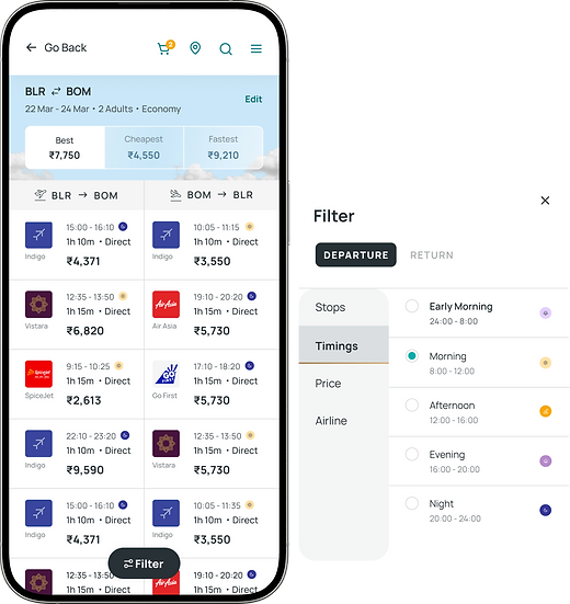
Flight Booking Screen
Simplifying Decision Making
In this screen, users can view both departure and arrival flights simultaneously which gives them clarity and enables them to make more informed decisions.
Design Features:
- Split Screen View
- Color coded icons to help distinguish between AM and PM flight timings.
BLR Airport App Home Screen

Crafting a Holistic CX
The introduction of the flight booking service on the BLR Airport App posed challenges in both discovery and access to boarding passes. I addressed this by designing multiple home screen entry points, such as coupons and time-to gate widgets. This would encourage users to explore the new service, ultimately driving business growth with user empathy.
Design Features:
- Personalized entry points that adapt to seasons, travel trends, and user needs.
Want to know my entire Research Process?
1
Identifying
Target Audience
2
Analyzing
User Insights
3
Identifying
Customer Pain Points
Conducting
Competitive Analysis
Mapping
User Journey
Identifying
Key Features
4
5
6


Making sense of the mess: IA Iterations
Issue: Initial iterations included both 'must have' and 'nice to have' features, complicating the user flow.
Resolution: After consulting with stakeholders, we deferred some of the nice to have features to Phase II, enabling us to focus on key elements and streamline the current experience.


Prototyping through Continuous Feedback
With the key features and IA defined, we started to capture ideas by sketching low-fidelity screens using pen and paper and validating them via user testing. It enabled us to examine our ideas before moving onto digital wireframes.
Observed User Behavior that guided design decisions:
-
Users tend to spend more time checking prices than completing bookings.
-
70% of users immediately utilize the sorting feature upon entering the flight selection screen.
-
Users prioritize finding the cheapest fares but are willing to pay more for better timings.
-
30% of users drop off during the booking process.
-
Users expressed frustration with locating their boarding passes and check-in areas post-booking, highlighting the need for a direct access point from the main BLR Airport App.


Wireframing Iterations


Designing to Ship
I ensured the design system was always updated to maintain consistency, uphold UX hygiene,
and reinforce brand identity.
Collaborated with:
-
BLR Airport
( Branding and Marketing Team ) -
Gray Matter
( Development Team )

Final Prototype
Learnings and Takeaways
-
Phase your Feature Rollouts
Integrating the add-ons section in phase II was crucial. Staggering feature rollouts in greenfield projects ensures smoother implementation.
-
Coordinate with Operations
Collaborating with airport on-ground staff was crucial to integrate essential functions effectively.
-
Avoid Assumptions
I found that users frequently deviated from expected paths, so it was crucial to set aside preconceived notions and approach the situation with a fresh perspective.

This is me presenting our initial flow to gather user feedback and capture their first impressions!
